In the world of data, it’s easy to feel swamped by all the numbers, graphs, and dashboards that might look cool but don’t tell us much. Effective analytics is more than just the numbers; it’s all about uncovering the story they have to share! Here’s a friendly step-by-step guide to help you make your analytics more meaningful and actionable.
Define Your Question
The first step in doing useful analytics is to nail down your objectives. If you dive into data without a straightforward question, you might end up with a dashboard that isn’t very helpful. Setting a specific focus will make your analysis much more streamlined and ensure that the insights you gather are relevant and valuable.
Think about it in specific terms:
Example Questions:
- “How many customer contacts are needed before a purchase?”
- “What’s the retention rate of customers who’ve bought twice versus three times?”
- “What percentage of leads turn into repeat customers?”
With your question clearly defined, you have a target. Now, you can identify the data that will answer it.
Identify Required Data
Once you’ve defined the question, consider the data required to answer it. This often involves identifying multiple data points across your systems.
Example Data Needs:
- Contact data: date and number of touchpoints.
- Purchase data: purchase amount, frequency, product category.
- Customer demographics: age, location, income bracket (if relevant).
Take a detailed inventory of the needed data and check for completeness. Missing or inconsistent data can often be more detrimental than a lack of data itself.
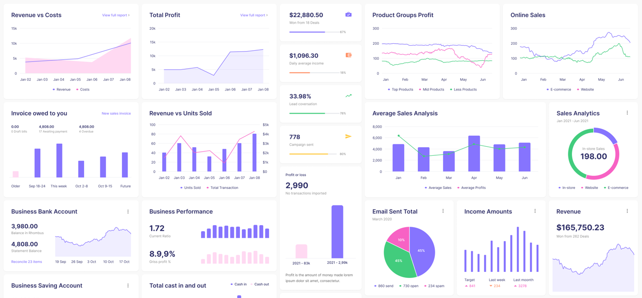
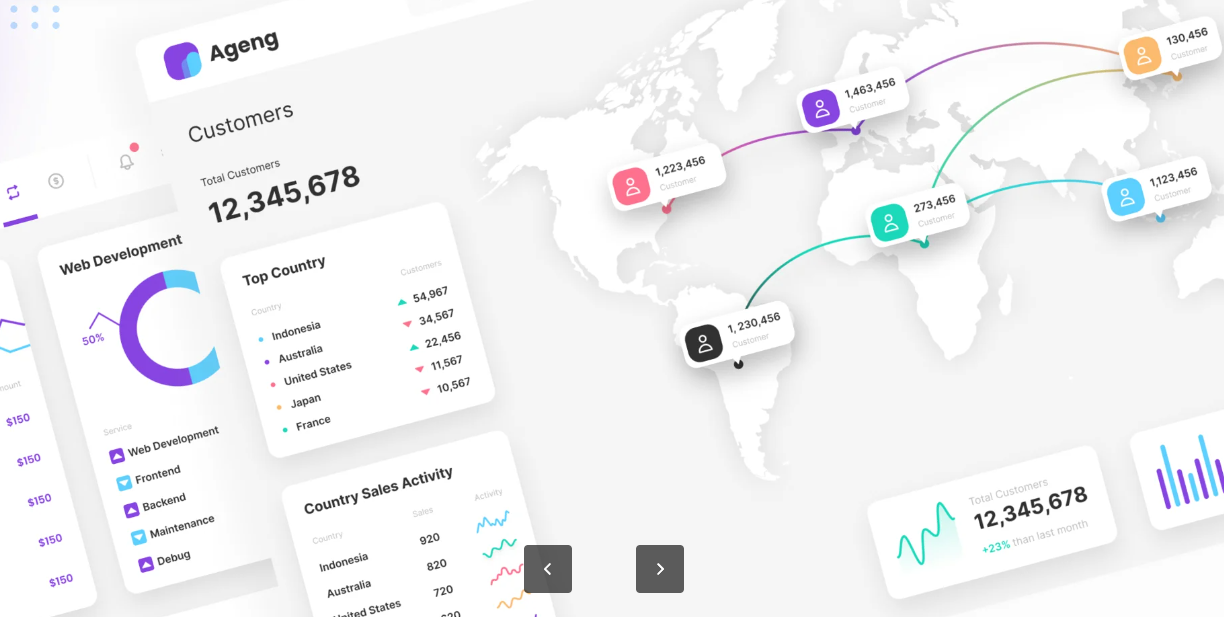
Data visualization helps people understand, it helps to convey a message
Design Integrations
After gathering your data sources, consider how they will interact. This stage involves planning the data flow and creating connections for a streamlined, real-time view.
Integration Examples:
- Integrate your CRM and purchase history data to track the customer journey.
- Link survey responses with engagement metrics to gauge satisfaction over time.
- Connect analytics tools like Google Analytics or Zoho Analytics with your sales data for conversion tracking.
Mapping out your integrations ensures that data flows seamlessly and answers your defined questions.
Create Visualizations
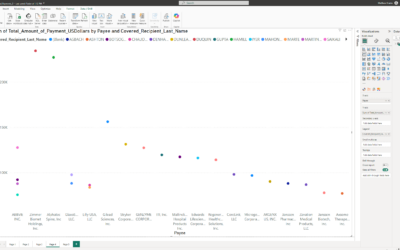
With your data integrated, the final step is visualization. A good visualization simplifies complexity, making it easy for stakeholders to interpret and act upon insights. Remember to tailor your visualizations to your audience.
Example Visualizations:
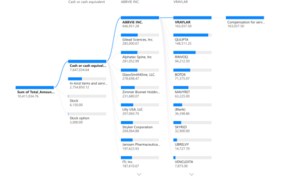
- Use funnel charts to visualize the customer journey.
- Heat maps to show customer interaction frequency across demographics.
- Line graphs to show purchase rates at various contact points (5, 7, 10 contacts).
Compelling visuals not only answer your question but highlight actionable areas for improvement.
Template: Making Analytics Actionable
1. Define the Question:
- What do I need to know?
- Example: [Enter your main question here.]
2. Identify Required Data:
- List the necessary data points and fields.
- Example: [Enter data sources and types.]
3. Design Integrations:
- Map data flow and necessary connections.
- Example: [Enter tools or systems that will integrate.]
4. Create Visualizations:
- Choose the visualization type that best answers the question.
- Example: [Enter charts or visuals to display the data.]
Using this approach, you’ll be equipped to turn raw data into meaningful insights, creating analytics that drive action instead of just sitting on a dashboard.

